library(here)
library(tidyverse)How do we go about plotting some spectral data from fluorophores, to get something like below?
Hey R friends, I need to plot comparative spectra and want to try that shaded area under curve aesthetic. Any tips? Looks something like this: pic.twitter.com/6FcTV36AY1
— Sebastian S. Cocioba🌻🛠 (@ATinyGreenCell) September 2, 2022
Getting the Data
I just downloaded as a .csv from FPBase for the fluorophores of interest.
dat <- readr::read_csv(
  file =  here("posts/2022-09-03-plotting-fluorescence/spectra.csv"),
  col_types = readr::cols()
  )


dat <- dat |>
  janitor::clean_names() |>
  mutate(
    across(
      -wavelength,
      ~if_else(is.na(.x), 0, .x)
    )
  )

dat
# A tibble: 473 × 8
wavelength egfp_em egfp_ex m_turquoise2_em m_turquo…¹ m_tur…² m_sca…³ m_sca…⁴
<dbl> <dbl> <dbl> <dbl> <dbl> <dbl> <dbl> <dbl>
1 300 0 0.0962 0 0.248 0.248 0 0
2 301 0 0.0872 0 0.227 0.227 0 0
3 302 0 0.0801 0 0.205 0.205 0 0
4 303 0 0.0739 0 0.185 0.185 0 0
5 304 0 0.0675 0 0.163 0.163 0 0
6 305 0 0.0612 0 0.148 0.148 0 0
7 306 0 0.0579 0 0.133 0.133 0 0
8 307 0 0.0541 0 0.124 0.124 0 0
9 308 0 0.0528 0 0.113 0.113 0 0
10 309 0 0.049 0 0.107 0.107 0 0
# … with 463 more rows, and abbreviated variable names ¹m_turquoise2_ab,
# ²m_turquoise2_ex, ³m_scarlet_em, ⁴m_scarlet_exMaking a Test Plot
dat |>
  pivot_longer(-wavelength) |>
  ggplot(aes(wavelength, value, fill = name, colour = name)) +
  geom_area(alpha = 0.3, position = "identity") +
  theme_classic()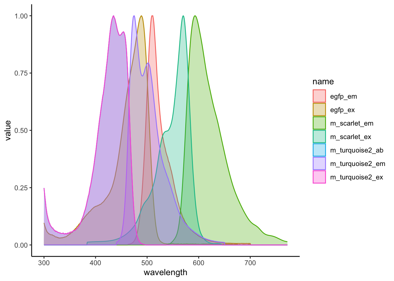
This is looking pretty good, but we want to try and get the line types distinguished by whether they are excitation or emission, and colour them based on just their fluorophore and not their fluorophore and their excitation / emission.
dat |>
  pivot_longer(-wavelength) |>
  mutate(
    type = if_else(str_detect(name, "em$"), "emission", "excitation"),
    fluorophore = str_remove(name, "\\_(ex|em)$")
  )
# A tibble: 3,311 × 5
wavelength name value type fluorophore
<dbl> <chr> <dbl> <chr> <chr>
1 300 egfp_em 0 emission egfp
2 300 egfp_ex 0.0962 excitation egfp
3 300 m_turquoise2_em 0 emission m_turquoise2
4 300 m_turquoise2_ab 0.248 excitation m_turquoise2_ab
5 300 m_turquoise2_ex 0.248 excitation m_turquoise2
6 300 m_scarlet_em 0 emission m_scarlet
7 300 m_scarlet_ex 0 excitation m_scarlet
8 301 egfp_em 0 emission egfp
9 301 egfp_ex 0.0872 excitation egfp
10 301 m_turquoise2_em 0 emission m_turquoise2
# … with 3,301 more rowsThis is working, but I have realised that we also have some absorbance readings in there, which isn’t what we are after.
dat_long <- dat |>
  pivot_longer(-wavelength) |>
  mutate(
    type = if_else(str_detect(name, "em$"), "Emission", "Excitation"),
    fluorophore = str_remove(name, "\\_(ex|em)$"),
    type = factor(type, levels = c("Excitation", "Emission"))
  ) |>
  filter(
    str_detect(name, "ab$", negate = TRUE)
  )

dat_long
# A tibble: 2,838 × 5
wavelength name value type fluorophore
<dbl> <chr> <dbl> <fct> <chr>
1 300 egfp_em 0 Emission egfp
2 300 egfp_ex 0.0962 Excitation egfp
3 300 m_turquoise2_em 0 Emission m_turquoise2
4 300 m_turquoise2_ex 0.248 Excitation m_turquoise2
5 300 m_scarlet_em 0 Emission m_scarlet
6 300 m_scarlet_ex 0 Excitation m_scarlet
7 301 egfp_em 0 Emission egfp
8 301 egfp_ex 0.0872 Excitation egfp
9 301 m_turquoise2_em 0 Emission m_turquoise2
10 301 m_turquoise2_ex 0.227 Excitation m_turquoise2
# … with 2,828 more rowsPlotting Again
plt <- dat_long |>
  ggplot(aes(
    x = wavelength,
    y = value,
    fill = fluorophore,
    group = name
    )) +
  geom_area(
    aes(linetype = type),
    position = "identity",
    alpha = 0.3,
    colour = alpha("black", 0.7)
  ) +
  scale_fill_manual(
    values = c(
      "egfp" = "green",
      "m_turquoise2" = "skyblue",
      "m_scarlet" = "tomato"
    )
  ) +
  scale_linetype_manual(
    values = c(
      "Excitation" = "dotted",
      "Emission" = "solid"
    )
  ) +
  theme_classic()

plt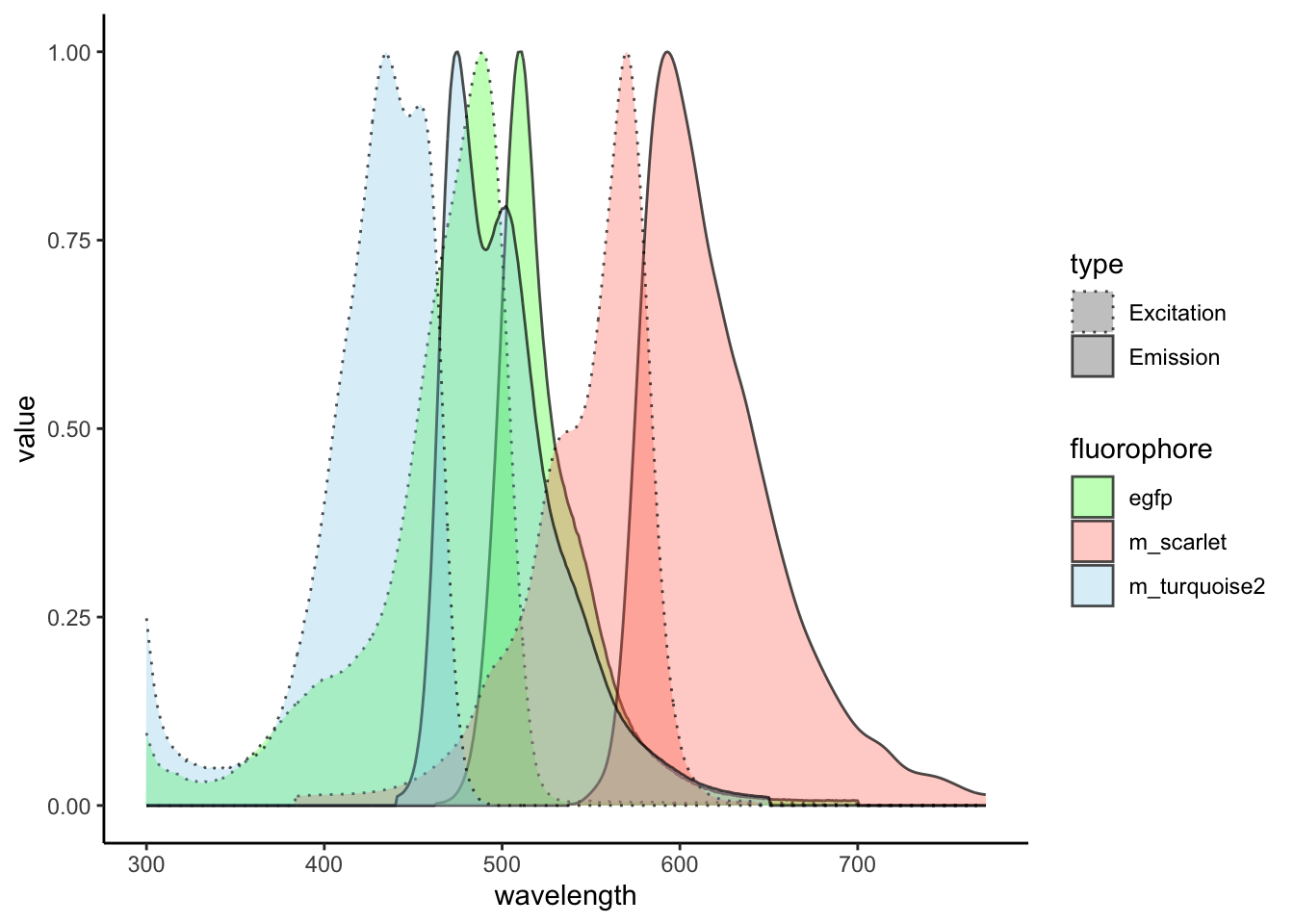
Let’s pretty it up a bit more.
plt <- plt +
  labs(
    x = "Wavelength (nm)",
    fill = "Fluorphore",
    linetype = ""
  ) +
  theme(
    legend.position = "top",
    axis.title.y = element_blank()
  )

plt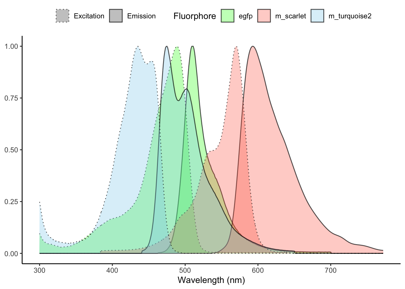
An Interactive Version?
With {plotly} we can quickly create an interactive web version from our hard work creating the {ggplot2} object.
plotly::ggplotly(plt)